A vulnerability in the Snoopy library was announced today. WordPress uses Snoopy to fetch the feeds shown in the Dashboard. Although this seems to be a low risk vulnerability for WordPress users, we wanted to get an update out immediately. 2.6.3 is available for download right now. If you don’t want to download the whole release to get the security fix, you can download the following two files and copy them over your 2.6.2 installation.
October 23, 2008
WordPress 2.6.3
October 20, 2008
The New 2.7 Dashboard
First, I’d like to say that I’m glad the majority response to the screenshots we posted last week was so positive. With a community as vocal as this one, it’s always a little nerve-wracking to introduce change, but this time it seems like the change was welcomed, which has been great. I’m hopeful that as we introduce the new features of 2.7 over the coming weeks, the good feelings will continue. As promised, here’s a rundown of what’s going to happen to the Dashboard over the next couple of weeks before launch.
Menus
I described the menu functions last week, but I forgot to mention something. By default, when you arrive at your Dashboard the first time, two sections of the navigation will be expanded: the Dashboard section (because it is active, so it will have the color highlight) and the Posts section (because it has often-accessed screens in it, and will serve as a cue that you can view other section menus without loading new screens). Once you start clicking menus open and closed, your browser will cookie you, and will remember your menu state. So if you open Posts and Comments, when you come back the next time, Posts and Comments will be open. If you click into your Settings, Posts and Comments will still be open. You’ll need to manually close nav sections. We went back and forth on this, and there was community discussion about perhaps only allowing two sections to be open at a time, but ultimately those approaches would have removed control from the user. And since the mantra of 2.7 is to give the user control over his/her admin interface, we chose to keeps things open if the user had opened them.
Contextual Access Tabs
In the upper right, drop-tabs provide access to contextual features displayed in a layer that appears between the header and the main working area. Screen Options will allow you to choose which modules to display on the current screen. Don’t like seeing the Incoming Links module because no one links to you? A simple checkbox in the Options tab will remove the module from your Dashboard until you decide to reinstate it. Help will highlight some of the changes since the previous version, and provide links to help resources such as FAQ/Forums/Contact Support for .com and Documentation/Support Forums for .org.
Module Layout
In addition to using the Options tab to decide which modules to display on the Dashboard, all the modules on the Dashboard may be moved up or down or between columns using drag and drop. Modules also may be collapsed or expanded by clicking the title bar, allowing another level of screen customization. In 2.8, we also hope to make every single module configurable in terms of what content it displays… we ran out of time for this in 2.7, so for now only the newsfeed modules will be configurable. When you hover over the module, a link will appear in the module header allowing access to the configuration view.
Right Now
The Right Now module contains the same data as before, but it’s been rearranged to provide a clearer display. This list style, as opposed to the previous sentence style, will also make translation for non-English sites easier. Color cues help to highlight things that are not good (red), things that are pending (yellow/orange), and things that are good to go (green).
Stats
I’d like to apologize for having a non-core piece of functionality on the Dashboard comp. It’s my fault… when we were working on the comps, we used my wireframes and my live 2.7 Dashboard to assemble our elements, and I forgot that I had the WordPress.com stats plugin installed and a module on my Dashboard. So even though it’s not in core and it turns out the WordPress.com stats plugin is undergoing some reworking of its own, we made the Dashboard stats module easier to scan than the one I currently see when I log in. For those of you on .org who got excited when you saw the Dashboard comp with stats, again, I apologize for the oversight on my part. If you want the candy-like stats goodness we comped up you’d need to install the plugin (or another stats plugin with candy-like elements). There should be a fine-looking Dashboard module as part of the update they release.
QuickPress
QuickPress is a new feature that provides the ability to start (or publish) a simple post from the Dashboard when you don’t need the full feature set of the Add New Post screen. Currently, these posts can contain title, text, media and tags. In 2.8 we hope to make the module configurable, so that each user can decide which few fields make the most sense to display. If you Save as Draft, you will see the new draft appear in the Recent Drafts module right away. Clicking Cancel will clear the form. Publish publishes the post. Posts made using QuickPress are the same as other posts and may be editing by going to Posts > Edit and selecting the post in question. One last thing: both in this module and on the Add New post screen, we’ve put as much space as possible between the Save Draft and Publish buttons, so for all of you who’ve asked at WordCamps or emailed or posted somewhere to request this, ta da! Hopefully this will reduce accidental publications.
Recent Drafts
During the summer testing, one thing we heard over and over was the desire to access recent drafts more easily, preferably with one click from the Dashboard (as opposed to clicking on Drafts from the Right Now module, waiting for page to load, then clicking on a specific draft title and waiting for a second page load). The Recent Drafts module is meant to address that need, displaying the five most recent drafts with the date they were created. In a future version, this module will be configurable as well. In the meantime, if you’re a crosswords-in-pen kind of person and you don’t write drafts, just use the Options tab at the top to hide the Drafts module, and it won’t take up space on your Dashboard.
Feeds
News feeds of WordPress-related news will function largely the same as they did in 2.6 in terms of configurability, and will simply have a new look. You can still specify the URL of the feed, how many items to display, whether to show headline vs excerpt, author, date, etc.
Incoming Links
Just getting a face lift. Or maybe not a face lift, more like a visit to the Clinique counter.
Hooks
Plugins can still add modules to the Dashboard. They also still can add top-level menu items if necessary (as opposed to having them in Tools, Plugins, Settings or wherever…like Posts if it’s post-specific). Because we’ll be using iconography in the collapsed menu state, plugins that create top-level menus can create an icon for use in the menu system. When there’s no icon associated with the plugin, a default will be used (kind of the way some blogs show default avatars when no Gravatar is associated with a commenter on your blog). Hopefully, though, most plugins will fit within existing section headers, since our “top level” is not actually made up of menu items, but section headers that open to reveal the real menu items that have screens associated with them. Plugins can also put themselves into the Shortcuts/Favorites menu in the header.
Recent Comments
This module, as in 2.6, displays the most recent comments. However, you now can moderate comments directly from this Dashboard module, including the new Comment Reply feature. For now it will show only the last x number of comments, as it does currently, though in 2.8 we hope to add more configurability to this, or roll it into the Inbox concept.
Bye-Bye Inbox
For those who were at WordCamp SF or who were using the nightly builds while there was still an Inbox placeholder, sorry, no Inbox in 2.7. It turned out to be far more complex than anticipated, and rather than including something rushed and clunky, we’re holding off until a later version. We added the comment moderation to the Comments module to make up for it, so you don’t have to wait for that, at least.
So that’s the new Dashboard. A little more usable, a little prettier, a little more you, a little cooler. Or maybe a lot of all those things. We’ll let you be the judge.
October 17, 2008
The Visual Design of 2.7
It’s finally here, the moment you’ve all been waiting for! The long months of your tolerance and forbearance as you suffered through the inelegance of our hacked-together, leftover Crazyhorse interface are almost at an end. (Was it really that painful?)
The visuals you have been craving are finally finished enough to show, and have been approved by the lead developers. We hope you like them. Mad props to Matt Thomas and Andy Peatling for their visual talents. You can expect these designs to be extended to the rest of the 2.7 screens and implemented over the coming weeks.
So now that we finally nailed down the look, how’s it going to work? The menu system in particular has been the topic of discussion on the hackers and testers lists, so I thought I would take this opportunity to explain how we plan for it to work. As you know, one of the goals of 2.7 was to reduce the necessity to load new screens just to access sub-navigation menus; we wanted the most-used screens to be within a click or two at most. If you’ve been using the nightly builds, you got used to the arrow controls that allowed you to expand and contract the menus. Then you got used to the box-style with icons that not only opened and closed vertically, but could be minimized horizontally as well, leaving a remnant of icons to provide a kind of “advanced mode,” though you don’t need to be particularly advanced to use it. Now that we have real button styles (the icons are still placeholders, and we hope to have some new ones soonish), we’ve nailed down the menu functionality.

2.7 New Post Screen, Unfinished
Each section header has three parts: the icon on the left, the blue link text, and the area to the right where an expansion arrow appears on hover or in expanded state. You can see that the arrow is contained in a small segment of the header, similar to the way the favorites menu is structured. If you click on this segment, the menu will expand to show the choices in that section. Click again to close the menu. Click on the blue link text and you will go directly to the screen for the first choice in that section, where the section menu will be opened to show you the other section choices. Double-click on the section icon and the menu will close horizontally, leaving the icon list visible. In this state, hovering over the icons will display the menus for each section, so you’re still only a click away from most screens. Double-click on an icon when the menu is closed this way and it will take you to the first screen in that section. The small arrows attached to the dividing lines between menu groups will also act as open/close toggles for using the horizontal collapse/expand function.
This variety of ways of using the menu system aims to accommodate both power user and novice alike. Clicking on blue link text like normal will bring the expected result for the novice, while the advanced user has more options for navigation that allow a more customized experience. We hope you like this result as much as we do, and you can expect to see it implemented in Trunk soon.
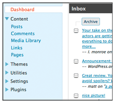
The image below is the new Dashboard style, for which I’ll save the explanations until early next week, but hopefully the preview will get you excited for the new design.

2.7 Dashboard
October 1, 2008
WordPress 2.7 Wireframes
 For those of you who have been downloading the nightly builds or contributing code to 2.7, you’ve noticed how quickly features are being added, small layout changes are gradually being implemented, and the application is morphing before your very eyes. For the most part, the response has been extremely positive, but even the people who love 2.7 have been wondering what it’s going to end up looking like. Though 2.7 is still a work in progress, we’ve put together a set of wireframes to illustrate how we think it will all turn out, so you can take a look under the hood of the design process, so to speak.
The PDF attached to this post outlines the navigation model, header elements, and important screens such as the dashboard, the new post screen, and list screens for posts, comments, and media.
Some things to bear in mind if you’re not used to looking at wireframes:
1. These are a guide, not a dictate. Changes may be made by developers and designers as needed for technical, aesthetic and/or usability reasons. When you have a team of superfast developers like we do, sometimes wireframes can become out of date quickly. In the two hours since these wireframes were approved, for example, already there are a few things that have moved and a menu change or two. Tweaks will continue to be made over the next week or two before freeze. This is Alpha software, not Beta, and it’s not static. That’s part of what makes it exciting, that every time it’s updated there’s something new.
2. These are all black/grey/white. That’s because we have a designer hard at work on visual styles for the new admin panel, including color palette, fonts, graphic elements, etc. When we have a new look to show off, we will. For now, the wireframes are “lookless” on purpose.
3. Not every screen is wireframed. We focused on creating wireframes for those screens that are undergoing the most change. For screens retaining largely the same functionality and layout, we have not included wireframes. In some cases, we’ll be updating screens but haven’t decided how to do it yet, so those aren’t included either.
4. Some elements apply directly to wordpress.com or wordpress.org, so don’t be alarmed if you see something that doesn’t seem to apply (like multiple dashboards).
One of the things I love best about WordPress is the vibrant community full of talented developers and designers who care about the application and want it to be the best it can be. Despite the overwhelmingly positive response we’ve gotten when showing 2.7 at WordCamps and from the majority of the community, there will always be people who would prefer it to be structured another way, which is why we love plugins! The decisions that went into 2.7 were based on a combination of usability testing results from 2.5 and Crazyhorse (both including laser eye tracking, official report to be released soon, but slides from WordCamp SF available in meantime), community feedback, personal and professional opinions, and some thinking about where the next couple of versions will be going in terms of new features, so that we will have a design that scales to accommodate some the features we hope to incorporate in the future.
So, I hope you enjoy getting an inside look at how we’ve been organizing our thoughts around 2.7, and that when the community feedback starts flowing everyone remembers that we all want the same thing: the best WordPress possible.
September 28, 2008
WordPress 2.7 UI Survey #2: Search box, Favorites menu, Future Publish
October 1, 2008 Update: The survey is now closed. Thanks to all those who participated.
Another round of mini-mockups and multiple choice questions awaits the first 5000 respondents. WordPress 2.7 UI Survey #2 is now available to take your opinions regarding:
- Where to put the search box
- Where to put the Add New Post button/favorites menu
- How to label the Future Publish/Edit Timestamp function
The survey (hosted by the good guys over at PollDaddy.com) will automatically close after receiving 5000 responses, which only took about two days for the navigation survey, so hurry over and cast your votes.
Note: when the survey has closed, these links will be disabled and this post will be updated.
September 15, 2008
WordPress 2.7 Navigation Options Survey
Note: Survey is closed as of 9/18/08. Thanks for the feedback!
 WordPress 2.7 is currently in development and as some people already know, it features a revised layout with a left-hand navigation column that was designed in response to user feedback regarding the use of screen real estate. Because the navigation came straight from the Crazyhorse prototype that was developed quickly for usability testing, it is still a work in progress.
Navigation sections and labels are being decided now, and as usual there are lots of good ideas floating around. As part of the mission to increase user involvement in design decisions, we’ve created a survey intended to give WordPress users the ability to play a part in deciding how the navigation options should be grouped and labeled. If you use WordPress and want to add your opinion, take the survey.
September 8, 2008
WordPress 2.6.2
Stefan Esser recently warned developers of the dangers of SQL Column Truncation and the weakness of mt_rand(). With his help we worked around these problems and are now releasing WordPress 2.6.2. If you allow open registration on your blog, you should definitely upgrade. With open registration enabled, it is possible in WordPress versions 2.6.1 and earlier to craft a username such that it will allow resetting another user’s password to a randomly generated password. The randomly generated password is not disclosed to the attacker, so this problem by itself is annoying but not a security exploit. However, this attack coupled with a weakness in the random number seeding in mt_rand() could be used to predict the randomly generated password. Stefan Esser will release details of the complete attack shortly. The attack is difficult to accomplish, but its mere possibility means we recommend upgrading to 2.6.2.
Other PHP apps are susceptible to this class of attack. To protect all of your apps, grab the latest version of Suhosin. If you’ve already updated Suhosin, your existing WordPress install is already protected from the full exploit. You should still upgrade to 2.6.2 if you allow open user registration so as to prevent the possibility of passwords being randomized.
2.6.2 also contains a handful of bug fixes. Check out the full changeset and list of changed files.
August 15, 2008
WordPress 2.6.1
With 2.6.1, we’re continuing our trend of releasing a maintenance release shortly after a major release in order to get fixes for the inevitable “dot zero” bugs into your hands without a long wait. If you’re happy with 2.6, however, keep on using it. You need not upgrade to 2.6.1 if 2.6 is getting the job done.
2.6.1 offers several improvements for international users. Styling of the admin for right-to-left languages is much improved thanks to the efforts of the Farsi and Hebrew translation teams, and a mysterious gettext bug caused by certain PHP configurations is now fixed. For IIS users, 2.6.1 fixes several permalink problems. Image insertion problems in the Press This feature experienced by IE users are also fixed. Of note to everyone is a fix for a performance bug in the admin where those with a lot of plugins would experience slowness on some pages.
Check out the full list of over 60 fixes to see if 2.6.1 has something to offer you. A full diff and list of changed files is also available. Download 2.6.1 and enjoy.
July 18, 2008
Theme Directory
It’s been a long time since themes.wordpress.net stopped accepting new themes. Since then most theme authors have been distributing their themes from their own sites, without a good centralized place for people to browse, search, comment on, and rate themes. With the success of the plugins directory, we’ve wanted to have those same benefits in a theme directory. Today is the day we start making that happen, with the introduction of wordpress.org/extend/themes/.
Bringing the new theme directory under the WordPress “extend” umbrella allowed us to take advantage of all the infrastructure that has already been built up to support WordPress.org. If you’ve browsed through the plugin directory, you’ll feel right at home in the new theme directory.
We’ve gone through great lengths to make this as painless as possible for theme authors. You don’t need to know anything about Subversion (our back end magic takes care of all that for you), just login with your WordPress.org username and password and go to the upload page. From there you upload your regular theme zip file and we take care of the rest.
Once you upload your new theme we do a few automated checks for some of the requirements for each theme. If we find one that you missed we’ll provide you an error and description of what needs to be fixed. When a theme upload has been accepted we’ll send you an email and put it in the queue to be reviewed, to make sure we didn’t miss anything. After the theme has been approved you’ll get another email letting you know that the theme is now live.
That catches you up to where we’re at today. When you finish that theme you’ve been slaving over, upload it to the new directory and let us know what you think. Since so much has changed since the old theme directory we’re starting fresh from zero. If you’ve got specific questions or suggestions contact us and we’ll do our best to get them answered.
July 15, 2008
WordPress 2.6
I’m happy to announce that version 2.6 of WordPress.org is now available, almost a month ahead schedule. Version 2.6 “Tyner,” named for jazz pianist McCoy Tyner, contains a number of new features that make WordPress a more powerful CMS: you can now track changes to every post and page and easily post from wherever you are on the web, plus there are dozens of incremental improvements to the features introduced in version 2.5.
We’ve prepared a brief video tour of 2.6, if you have 3 minutes and 29 seconds to spare, it’s worth a watch:
If you’d like to embed the tour video in your blog, copy and paste this code for the high quality version:
<embed src="http://v.wordpress.com/mARhRBcT/fmt_dvd" type="application/x-shockwave-flash" width="640" height="385" flashvars="blog_domain=http://wordpress.org/development/2008/07/wordpress-26/&width=640&height=385"> </embed>
And here’s a smaller version, 400 pixels wide:
<embed src="http://v.wordpress.com/mARhRBcT/fmt_std" type="application/x-shockwave-flash" width="400" height="250" flashvars="blog_domain=http://wordpress.org/development/2008/07/wordpress-26/&width=400&height=250"> </embed>
Here’s a more textual overview of what’s hawt in 2.6:
Post Revisions: Wiki-like tracking of edits
With the power of modern computers, it’s silly that we still use save and editing metaphors from the time when the most common method of storage was floppy disks. WordPress has always respected the importance of your writing with auto-save, and now we’re taking that to another level by allowing you to view who made what changes when to any post or page through a super-easy interface, much like Wikipedia or a version control system.

This is handy on any blog in case you make a mistake and want to go back to an older version of a post, and it’s super handy for multi-author blogs where you can see every change tracked by person.
Press This!: Post from wherever you are on the web
A few months ago on my blog we started a conversation about the posting bookmarklet in WordPress and which systems we should look to for inspiration, like Flock, FriendFeed, Facebook, Tumblr, and Delicious. From these suggestions and the Quick Post plugin by Josh Kenzer, we developed a Press This bookmark you can add to your toolbar that provides a fast and smart popup to do posts to your WordPress blog:

For example, if you click “Press This” from a Youtube page it’ll magically extract the video embed code, and if you do it from a Flickr page it’ll make it easy for you to put the image in your post. On my blog I’ve been experimenting with using different categories and the in_category() function — such as video, quote, aside, et cetera — to create a more tumblelog-like format.
Shift Gears: Turbo-speed your blogging
Gears is an open source browser extension project started by Google that developers like us can use to give you features we wouldn’t normally be able to. There are a lot of things we can do with Gears in the future, but in this release we’ve stuck to using what’s called a “Local Server” to cache or keep a copy of commonly-used Javascript and CSS files on your computer, which can speed up the loading of some pages by several seconds (they just pop right up!). You can install Gears for Firefox or Internet Explorer, with support for Safari and Opera pending. WordPress works just fine without it, you just get a little extra juice when you have it installed.
Theme Previews: See it before your audience does
Now when you select a theme it pops up a window that shows the theme live with all your content, instead of immediately making it active on your site. This is great for just test driving themes before making a switch over publicly, and it is also helpful when you are developing a theme and need to test it but don’t want everybody to see your ongoing mistakes development.
Here are some of the smaller features and improvements in 2.6:
- Word count! Never guess how many words are in your post anymore.
- Image captions, so you can add sweet captions like Political Ticker does under your images.
- Bulk management of plugins.
- A completely revamped image control to allow for easier inserting, floating, and resizing. It’s now fully integrated with the WYSIWYG.
- Drag-and-drop reordering of Galleries.
- Plugin update notification bubble.
- Customizable default avatars.
- You can now upload media when in full-screen mode.
- Remote publishing via XML-RPC and APP is now secure (off) by default, but you can turn it on easily through the options screen.
- Full SSL support in the core, and the ability to force SSL for security.
- You can now have many thousands of pages or categories with no interface issues.
- Ability to move your
wp-configfile andwp-contentdirectories to a custom location, for “clean” SVN checkouts. - Select a range of checkboxes with “shift-click.”
- You can toggle between the Flash uploader and the classic one.
- A number of proactive security enhancements, including cookies and database interactions.
- Stronger better faster versions of TinyMCE, jQuery, and jQuery UI.
- Version 2.6 fixes approximately 194 bugs.
Developer Notes
WordPress.org had over 75 people contributing code to WordPress 2.6. In addition to the core commit team we had contributions from Dion Hulse, Austin Matzko, Otto42, Benedict Eastaugh, and pishmishy. AaronCampbell and Marco Zehe provided more than a few patches. Back among the top code contributors is Jacob Santos. Alex Concha continues to have WordPress’ back. Joining bug reporting and gardening elite are hakre, Simon Wheatley, mtekk, and Matty Rob. Finally, congratulations to our Peter Westwood on your recent wedding! I’m also proud to announce we’re adding a new core committer to the team: Andrew Ozz (azaozz) has been a huge help to the core team this year, particularly around TinyMCE and making the WYSIWYG something that works for you, not against you.
Because of the new capabilities to make WordPress a clean SVN checkout, plugin and theme authors should do their best to handle forms and posts through WP rather than trying to post to their files directly, here’s a quick Codex article about how to do it using our forward-compatible APIs.
Upgrading
2.6 is pretty much identical to 2.5 from a plugin and theme compatibility point of view, so upgrades from 2.5 should be pretty painless. The 2.5 branch will no longer be maintain so everyone is encouraged to upgrade. Our standard 3-step upgrade instructions apply to this release. There were at least 1,984,047 downloads of the 2.5 series, the fastest growing release we’ve ever had, and I think all of those people will find 2.6 adds a level of polish that really makes WP a pleasure to use every day. (At least I do. :))
Easter Egg
There have been rumors and allegations that there was a so-called “easter egg” added to 2.6 early in its development. These rumors and allegations are completely false!
P.S. If you’re a fan of WordPress, consider joining our fan page on Facebook.
0.157